Showing posts with label layers. Show all posts

Thursday, March 14, 2013

Rushy Anim Tut for Walk-cycles


Update: most of what is contained in this video is still valid as far as it goes, however I have now moved to Spine for my in-game animations.  I will still be using AS9 for cut-scenes.

Check the post I wrote about Spine character animation for more details on that amazing tech.

---

This is a very quick export of first walk-cycle animations, showing a bit of how I work.  I'm still in the middle of working on this so its rough, but I thought I would take this moment to cover what I have learned for my in-game character animations.

First can I say that AS9 Pro is very good for this job.  Combined with TexturePacker this process gives you a set of sprites in a sprite sheet that you can drop right into your Cocos2D game.

The horizontal lines show my method for getting the walk correct.  I recommend this excellent tutorial on the fundamentals of the walk-cycle at AngryAnimator.com - refer there for the meaning of the pose names and to explain the lines.  That tut is for pencil-and-paper cel animation but its by far the best of any tutorial I have seen yet.  The best insight it has that you need to base your cycle around the contact pose, which is when the legs are at their farthest apart.

There are some differences taking Angry Animator's method to the 2d-bone animation technique, but most of it is the same.  In the computer-animation your big bug-bear is skating/sliding.  To fix this I do the animation with a translation (so the character moves across the room as well as pumping his/her legs) and this allows me to mark the foot-falls and retro fit the feet to the marks.  This seems to fix skating quite nicely.

To get my sprites the right size I use one of my game rooms as a background and then I can position the character at the largest size it will need to be against that room.  Then when I do the export the Anime Studio camera is set at the same size as the background, so the PNG's that are exported have the character sprites at the correct size.  Because I use TexturePacker I don't have to worry about the vast amounts of transparent pixels all around each PNG frame exported: TP will remove that and pack the actual sprite into the sheet.  (Note, I have made a terrible job of this part in the sample files shown here -   but they are just for illustration only).

Having the game background also allows me to do the sprite sheets for other animations such as sitting down on the bed, reaching for the window and so on.  Here I'm just talking about the walk animation.

Here is my process:  I do my animations as a walk with translation by:
  • Set the animation marker to frame 0
  • Draw and rig the character
  • Draw the guide lines on a seperate layer based off your character
  • Pose the bones to the contact pose; left-leg in front
    • This counts as your first step/foot-fall
    • Mark its position on the guide line layer
  • Measure out 3 more strides to find the foot-fall points on the guide lines
    • Temporarily translate the character in its contact pose
      • Using legs & feet like a pair of dividers
      • Mark each foot-fall positioning the back foot at a mark
      • Then do mark a new foot-fall at the front foot
    • To mark I use Anime Studio's "note" feature
  • Translate the whole character so that the 4 strides take 48 frames by
    • Move the animation marker to frame 48
    • Translate to the final marked position at 4 strides completed (4 steps/foot-falls)
    • Don't use bone translate for this - use whole-character-layer translate
  • Go back to frame 0 (contact pose; left-leg in front)
  • Copy the contact pose at frame 0 to 24 and 48
  • Create the opposite contact poses at frames 12 and copy to frame 36
    • See Angry Animator's tutorial
    • Use the Z move bone tool to switch the legs over
    • Keep the character at the same height
  • Now add the recoil poses at 2 and copy to 26
    • Use the translate bone  on the root bone (not the whole character) tool
    • move the character down to the lower guide mark for the head
    • The recoil is the lowest pose so head-height  should be checked carefully
    • Adjust the feet to the foot-fall marks so they don't skate or slide
    • Adjust the legs to the "sink" pose so the feet are still on the lines despite the lowering
  • Copy the recoil pose to 14 (and dup to 38)
    • Copying key frames makes sure you get the height & attitude right
    • Switch the legs front-for-back to get the correct opposite pose
    • Make sure you don't change the height of the recoil when doing this
  • Do the high-point at 8 (and copy to 32)
    • As for the recoil use translate bone on the root bone to move character up
    • Copy these forward as for the recoil and switch to get the opposites at 20 & 44
  • Do the passing pose at 6 (and copy to 30)
    • Do the opposite passing poses at 18 & 42
  • Add in hand-arm swing, bending the elbows
  • Add in some head bob, and other movements
    • I did ponytail up in the recoil and down in the highpoint
Once complete, run the animation through on loop mode over and over, looking for timing issues, mistakes and unevenness.  Tweak as necessary.

I find its impossible to do this without the translation in the animation (as above) especially with respect to removing/reducing skating, where the characters feet slide or "moon-walk" across the ground.  Also, even though technically you could do all the above in 24 frames instead of 48 I find it much easier to have the extra framing so I can see what I'm doing.

Once everything is golden, you're ready to create game art.

Choose the key frame channel for whole-of-character translation (not bone translation) and delete it.  This will remove the character animation that does the travel across the room, and leave all of the bone translations and rotations done for the walk-cycle itself.  If this somehow removes your height adjustments done for the recoil or high-point poses (because you used whole of character translate instead of bone translate) then undo the delete, and go back - carefully remove the bad keys and replace with bone translate keys.  See the above.

At this point playing the animation should show your character doing a 48 frame in place walk-cycle, with nothing else on the screen.  Now to export game ready art, hide the guide lines, any background images used for scale and go ahead and choose "Export Animation".

Select the PNG exporter from the drop-down.

You only need to select 25 frames of the above animation.  I do a full 48 frames so I can select the part that looks good, and because I find its easier to check the animation for errors.

If you go with the passing pose as your start frame then it works well with a standing character moving into a walk because the feet are together, and then one picks up and starts walking.  To do that, in the export dialog choose 18 as the start frame and 42 as the end frame.

At this point you also have the choice to export at half-frame rate by checking "Render at half frame-rate" on the export dialog.  This will give you 13 frames when exporting frames 18 to 42, and 12 frames per-second is probably OK for most games.  If you need 24 frames a second leave this box unchecked and you'll get 25 frames.

Run the export, choosing a folder (use create folder if needed) to put the frames into.  Don't worry about background colour - PNG export by default will alpha out all the background for you.

Now you can use Texture Packer to put the frames into a sprite sheet, by dragging and dropping the folder you exported the PNG files to.  Follow Ray Wenderlich's excellent tutorial for this - I won't repeat the details here.

The sort of result you get is as here (although this is a PNG sheet).  

Note that I have done a power-of-two sheet with my crazily large sprites.  This sheet is 2048x2048 (fine for desktop but bloated for mobile).  You can (and should) do a non-power-of-two (NPOT) sheet if you know that your platform supports it.  Most new platforms do.  Also using the pvr.ccz compressed PVR format will give a good result in sprite sheet size with fast loading times as well on mobile - check the Wenderlich tutorial for more details.

Saturday, December 15, 2012

Preparing Scanned Line Art

For those times in your game where you need a more visual sort of element - like say the image that goes in an inventory for an RPG or adventure game - starting with a drawing is a good quick way to go.  Pixel art is great for small sprites, but if your image is going to be say 1/2 the screen size starting out clicking on pixels is going to take you a while.  For this kind of thing I often like to work with scanned in hand drawings.

But how do you get those drawings looking like the high-contrast, well defined rendered or pixelated images in the other parts of the game?  Maybe you don't and you want a more hand-drawn effect, but in this tut I'm going to show how I prep hand drawn images for import and coloring to use in my game.

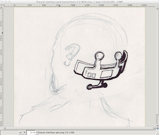
Prepare the pencil based artwork on a nice big piece of paper.  Don't worry about the details as you'll work over these in pen later.  Here I just wanted the neural interface gizmo to look like it would go on a human head, so that head is just there to get the shape right - it will disappear in the final result.  Notice how I don't bother rubbing out either - when I want to reposition something I'll just draw over it in the new spot, and pick the right line when I ink it.  Also note that I have not used blue - you can but typically you don't need blue pencil, and black pencils come in more kinds and are cheaper.


Ink over the pencil using your favourite pens.  I use Mitsubishi uni-ball ink pens which are nice and fast and dark, and Pentel chisel point art-markers.  I have some crow quills and a tub of ink somewhere but they're so messy.  Fibre tip fine pens are OK, but I find they scratch and split too much as I always press too hard.  Ball tips are fine as long as you start out with a big piece of paper.

Don't fret too much about mistakes as we can correct a lot of things digitally later.  The main thing is to get the ideas out onto paper.  Make your inking fairly bold and go over outlines to strengthen them up.  Areas with more ink I use the marker, sometimes I can get away by using the edge of the chisel-point, other times I have to go over the lines several times with the ball-tip.

Time to scan.  I just use a cheap CanoScan LiDE 25 USB scanner that works fine with my Mac gear.  Scan at 600DPI, and use the color setting, not the black and white.  I find if you try to go that way you'll lose too much detail from the drawing.  Its much better to threshold it in the drawing program as I'm about to show below.  Crop out unnecessary blank paper using the scan dialog if needed.  This will make the sketch load into Gimp a lot quicker.

For my art work I use a mixture of Manga Studio Ex for full comic spreads, and the Gnu Image Manipulation Program or GiMP for detail work.  MSEX is good but expensive.  And for some jobs GiMP is just as good.  If you're on Mac and haven't used GiMP for a while it has gotten really good, thanks to the work of the Free software community - it now runs natively and does not require an X server.  Its also a lot faster and many of the weird mouse-focus issues are fixed.  Obviously if you're on Windows or Linux, your mileage may vary.  For this article I'll be using GiMP, but the principles and tools apply to most platforms and other drawing programs even tho' the actual commands and menus may change.

Load up the image into GiMP.  Notice how the yellowy paper and pencil work is visible right now.  That's fine and you want to be able to pick and choose what stuff you leave in and out.

You should have a large image - mine came out 2310 x 2284.  If you get a small image - say 1024 x 768 or similar then your line work is going to get eroded by the threshold which is not what you want.  Either you need to get a bigger bit of paper and draw bigger, or check your scan DPI and ensure its 600DPI or maybe try a higher setting.  The images here have been scaled down to make for smaller uploads so don't go by their sizes.

Now for thresholding.  Right click on the image in GiMP to get the menu and choose Colors > Threshold.  If you're lucky the auto setting will be about right.  If there is too much unwanted stuff, or not enough ink, move the sliders around until you're happy.


Now that we have just the inked line art, we need to get it onto a transparent layer so that color can be applied.  The actual color will be done in another article/tut but getting the setup right as I'm about to show should apply to almost all methods of coloring that you might want to do.  The way it is right now looks OK, but the problem is any fills you apply will not appear to go right up to the edge of the line.  What you want is the line art on top of the color so that you can avoid white pixels where the lines edges are aliased.

Right click on the drawing to get the GiMP context menu and choose Select > By Color.  Click in the black line work, and after some time you should see all the ink selected as below.  It takes GiMP a while even on faster machines as it has to color match every pixel and we have a big image here.  Once its selected, choose Edit > Copy.  Now create a new layer, by clicking the anonymous little white "New Layer" button in the bottom-left corner of the layers dialog.  Name your layer "line-art".  Make sure the layer is transparent (not background color).


With the new layer selected choose Edit > Paste.  In the Layers dialog you will see a "Floating Selection".  Click the Anchor button on the Layers dialog to anchor it to your new layer.  Try turning on and off the eye icons - you should see that you now have a layer with just the linework and a transparent background.  Its hard to see what's going on with the linework, because of how transparent layers are displayed.  Next we'll add a white background to fix that.

Let's add two more layers: one will be transparent - call it "color" as this is where our color will go; and the last one will be white - call it "white background".  I always make a practice of naming my layers as they can quickly get out of control in a larger piece of art.  Make sure the line art is on top, with the transparent color layer and white background underneath.  You can turn off the original import by clicking the eye, as you don't really need it.  Turning it off should make your image appear just the same as after thresholding.  Now your layer dialog should look like this.


This is a good time to save your work.  Make sure that you save it in the .xcf format, by putting the characters ".xcf" as the file name ending.  This is GiMP's native format and it will preserve all your layers and so on.  Think of this as like the "raw source code" of your image, and you will "compile" it later by exporting to other formats such as .png.  If you don't have the xcf around its hard to recapture the structure of your drawing, so save to .xcf, save early and save often.

OK now we want to start cleaning up the image.  This involves a few GiMP skills that I will try to describe in more detail in another tutorial, but here is the guts of it:

  • do a lassoo select around your line art and then choose Select > Invert so that your next operation will apply to everything outside your linework.   Now use a really large eraser to clear out all the little dots and blobs from the background.
  • zoom in to your work with + and go over the lines with the Ink tool - press K to get it quickly and switch between Ink and Eraser (Shift E) as you clear up the lines
  • try using the "smooth" setting on the ink tool to help stabilise your ink strokes, and experiment with the settings.  I prefer a hard edged brush so check the brush settings if you're getting an effect that doesn't look right
  • to get long smooth lines you can use the Path tool and tell it to trace the path in Ink.  This works well but is complicated to get right and is the subject of a tut all by itself
  • fix up larger issues like scale or perspective by lassoo'ing the offending chunk of linework and using the rotate, shear and other transform tools.  Save is your friend.  command-Z is undo.

This shot shows removing splash around the linework using inverse-select and a large eraser.  (The screen grab didn't capture the eraser but its as big as the whole line art and clears the page in a few swipes).


Here I have cleaned a lot of linework with the Ink and Eraser tools - see around the nodule thing on the right hand side especially - and also the underneath chrome part has been rotated so its perspective is a bit more correct to the rest of the device.  (I took the inverse-select screenshot after doing this cleanup so to see the effect compare it with the post-threshold image above).

Save the .xcf file again at this point and use the "Save a copy" feature so that you can revert back to your good line art if something goes wrong.  Give it a name like "my-device-line-art.xcf".

At this point you would go ahead and start applying your layers of color on your "my-device.xcf" working image file.  Make sure to use separate layers, and not to mess up your line art layer.  Just to show the beginnings I have blobbed some color onto a couple of layers - the blue (which would become a metal chrome color job) is on the "color" layer from before and the orange I have put on a layer above that called "lights".


Anyway - that's all for this one, and hope you have fun GiMP'ing your line art.