Showing posts with label art. Show all posts

Thursday, May 23, 2013

Early Results with Artboard

I've started using Artboard, a fairly simple vector graphics program for the Mac, to do some of my in-game artwork.  Basically I put my room render in as a background so I can get the scale and perspective right, then draw the artwork for the items and props in the room over the top.

I have been using Anime Studio and Manga Studio for this, at various times.  I use Anime Studio as its the vector graphics based animation package that I use for doing my characters, and I need that same look for the in-game items.  Trouble is since its an animation package its not well suited to just doing static graphics.  I therefore was using Manga Studio which is my comic drawing software - it gives lovely pen strokes and cel shading as per Manga comics, but unfortunately the resulting look is not really a match for the vector art that comes from Anime Studio.

Hence I have picked up Artboard, for $35 from the AppStore.  I would have looked at Illustrator but its very expensive and over-featured for what I want.  I also tried Inkscape and that would have been my preference but the performance going through X-Quartz on the Mac was just awful.  On bigger drawings that pen lag was just killing me.  Artboard is a nice combination of features and for price, and has great performance on my laptop.

Here's some of the things I have done with it so far.

Alarm Clock to wake our hero up out of bed

Handy screwdriver

Room render with Artboard drawings on top
It's not perfect, but there is a lot to like here.

I particularly like the expert styles - I used the ability to create copies of the stroke and outset each one to create the sort of "bevelled-in" look on the dial face for the clock.  This stroke was stacked on top of one of Artboards pre-packaged styles, a glossy black which was just right for the face of the clock.

The point editing mode of Artboard is very good too - you can quickly go from shape manipulation mode over to path mode and back again, just by double tapping on the object.  In Inkscape its not so easy to go between treating an object as a path and as a shape.

I have come across a few bugs, but the authors of Artboard - one of whom is an Australian software engineer - seem to be quite responsive, and they're producing new releases so it looks hopeful that these will get dealt with soon.

If you're looking for a simple but relatively powerful and fun graphics editor for your game work I recommend giving Artboard a try.

Friday, May 3, 2013

Trimming Transparency Follow-up: Cropping

Just a really quick follow-up to my recent post about trimming your static images.  I got some great thoughtful comments on my G+ account regarding this and it got me thinking - I needed to clarify how you could use this same technique not just for static images but also for animation sprite sheets.

I posted an update section on that recent post, but I'll repeat it here:
Update: I realised that this post could confuse people into thinking that your sprite sheets of animations could be processed this way. This won't work. I know I said these images are coming out of my animation program but that is because they are stills that I use for the various static poses, and since I use AnimeStudio for all my character art I have to get the sprites looking consistent, so that means whether animated or still I need to use the same program.
Why not? When you trim off the transparency close to the colored pixel content that means the position of the character in the frame will change from frame to frame giving a jittery effect. Definitely not what you want for your animations. But for static poses this technique works just fine.
OK - so how could you use ImageMagick to trim your animated sprite frames?  There's two comments to make before we dive into the script I came up with to help with this:

  • First - do you really need to trim them?  TexturePacker makes a good job of ridding yourself of these extra transparent pixels, and if you already have a way of hit-testing that won't be compromised by the extra alpha may not be a problem.  Thanks to +Krzysztof Bielawski for highlighting this.
  • Second - lets use the word crop to refer to the process of cutting off unwanted parts of the image to precise pixel dimensions
    • Trimming refers to getting rid of all alpha transparency regardless of where that happens to be pixel-addressing-wise.
If your game doesn't require hit testing your animated sprites in that way - maybe you just use a simple radius test - then there's no point in worrying about this trimming probably.

If we do decide to go ahead with this lets get terminology right - ImageMagick uses these terms and from my graphics work I follow the same approach.  Trim means cutting away unwanted stuff (no matter what the dimensions) and cropping is like guillotine - once you position the bounds to the pixel that is where the cut falls.

OK - so we're going to crop?  Here is how to do it:

convert my_sprite_0001.png -crop \
    '309x518+65+238' +repage my_sprite_cropped_0001.png

By referring to my recent post, you can find out how to install ImageMagick, and what the "convert" command-line here is doing.  As before the repage is recalculating the page meta-data after the crop command.

What's new is the -crop and the strange expression in quotes.  '309x518+65+238'

The first two numbers (seperated by the "x" character) are the width and height of the area to be cropped out.  This area needs to be as large as the union of the bounding rectangles of all the sprites in your animation sequence.

The second two numbers represent the offset into your source image (my_sprite_0001.png in the above) as an x, y coordinate pair - with the top-left of the image as the origin.

Note that Cocos2D and many other OpenGL based game kits use the bottom-left as the origin - and mathematical co-ordinate systems do this too.  Take a bit of care to make sure this is right.

Wait: what?  Union of the bounding rectangles?  Yup - this just means that whatever rectangle you choose as your crop is going to be the same size and position for every crop operation done on your folder of images.  This means that in order to avoid cutting off any part of one of the animation frames it will need to be equal to all of the rectangles that would have been used in a trim operation, all overlaid over each other - this "rectangle summing" is called the "union".

In practice I found the easiest way to do this is to find a large image, say the "contact pose" - see my early "rushy animation tut" post - and put a box around that with my image editor (I use GiMP, but you might use photoshop) and check the dimensions and offset.

Then I run my crop script using those dimensions, and check the result using Preview - if an image in the sequence got some part cropped off I can open that in my image editor and adjust those dimensions.

Checking the crop by using the Preview program on Mac
Here's an example of the script running, copied straight out of my Terminal session. Just after the script does its processing I run Mac's Preview program on all the images by using the "open" command:

~/Documents/Art/animations sez$ ./cropdir.sh walk-cycle-side-12fps-fresh 309 518 65 238
About to make cropped copies of the files in walk-cycle-side-12fps-fresh and place into walk-cycle-side-12fps-fresh-converted-1367637222
The resulting cropped copies will be 309w x 518h and at offset 65, 238 in
the image.

Continue (y/n) ?  [N]: >Y
   walk-cycle-side-12fps-fresh/walk-side_00001.png    -- cropped to -->   walk-cycle-side-12fps-fresh-converted-1367637222/walk-side_00001.png
   walk-cycle-side-12fps-fresh/walk-side_00003.png    -- cropped to -->   walk-cycle-side-12fps-fresh-converted-1367637222/walk-side_00003.png
   //.... more
   walk-cycle-side-12fps-fresh/walk-side_00047.png    -- cropped to -->   walk-cycle-side-12fps-fresh-converted-1367637222/walk-side_00047.png
   walk-cycle-side-12fps-fresh/walk-side_00049.png    -- cropped to -->   walk-cycle-side-12fps-fresh-converted-1367637222/walk-side_00049.png
~/Documents/Art/animations sez$ 
~/Documents/Art/animations sez$ open walk-cycle-side-12fps-fresh-converted-1367637222/*

And this is a complete listing of the script I use. As before - caveat emptor, backup before use, all care, no responsibility.

#!/bin/bash

# Copyright Sarah Smith - http://indiegamecodingconfessions.blogspot.com

# ImageMagick is from http://www.imagemagick.org

# This script is placed in the public domain - feel free to use it how you
# want, though a link to this blog would be nice.  :-)

if [ $# != 5 ]; then
    echo "Usage: $0 <dirname> <width> <height> <x-offset> <y-offset>"
    exit 1
fi

# Halt execution the second a command fails
set -e

# Uncomment this line to get debugging info
# set -x

UNIQ_NM=$(date "+%s")
DESTDIR="$1-converted-$UNIQ_NM"

echo "About to make cropped copies of the files in $1 and place into $DESTDIR"
echo "The resulting cropped copies will be $2w x $3h and at offset $4, $5 in"
echo "the image."
echo ""
echo -n "Continue (y/n) ?  [N]: >"

read goahead

if [ "x$goahead"="xy" -o "x$goahead"="xY" ]; then

    mkdir $DESTDIR
    GEOMETRY="$2x$3+$4+$5"

    for fn in $1/*; do
        DESTNAME=$DESTDIR/$(basename $fn)
        convert $fn -crop $GEOMETRY +repage $DESTNAME
        echo "   $fn    -- cropped to -->   $DESTNAME"
    done

fi

And you can download this script from my Dropbox.  As in my previous post, just chmod it to executable and run it from the command line as above.

Happy image hacking!

Thursday, May 2, 2013

Trimming Transparency from Images

When you export images from some programs, you wind up in some cases with the actual content as a small area of coloured pixels in a sea of alpha transparent nothing.

This happens to me when I'm animating my character around and I'm doing so against a background that is say 1024x768 where the actual character's image is a tiny percentage of that size.

A 1024x768 png from my animation program
This is completely to be expected - the designers of your other programs always have to assume that your export is intended to be the size of your original canvas; but when you have dozens or maybe even hundreds of frames of animation all with wasted transparent pixels, removing it all by hand using GiMP or Photoshop is agonizing.

When you're using TexturePacker or ZwopTex your transparent pixels are probably removed nicely for you when the sprites are stored, but still they can mess up your hit testing and on-screen positioning for your game.

The image content I want with extra transparent pixels cropped away
Here is a way to crop those transparent pixels automatically in large batches, and the program to do it is free.

OK, this is what you need - the ImageMagick program from ImageMagick.org - a fantastic and very powerful set of command line tools.

I'm on MacOSX Mountain Lion and found this great installer which the guys at Cactus Labs have put together - it was just case of clicking through and it all just worked!

Once you have ImageMagick installed check that it is working by opening up a command line - on MacOSX, just do <command>-<space> to access Spotlight and type "Term" and you should be able to hit enter on the first match to get the Terminal.app program running.  Then at the command prompt type:   convert -version


~/MyArtWork sez$ convert -version
Version: ImageMagick 6.8.4-8 2013-04-08 Q16 http://www.imagemagick.org
Copyright: Copyright (C) 1999-2013 ImageMagick Studio LLC
Features: DPC OpenMP
Delegates: bzlib jng jp2 jpeg lcms png tiff xml zlib

That shows that the ImageMagick command line tool called "convert" is up and running. The script I'm about to show you won't work if this command is not available.  If you had a Terminal running when you installed ImageMagick you may need to close and re-open it to get this to work.

Now the basic technique is to use two commands that convert knows about:
From the command line the trim command looks like this:

convert my_image.png -trim +repage my_image_trimmed.png

The trim command is what does all the work - it samples the image at the corners and assumes those pixels are what the background of your image is.  Then it crops in the image as small as it can on all four sides - providing that the only pixels it is throwing away are that background color it sampled.  It works with all colours of background, not just alpha transparent (which ImageMagick calls the colour name "none").

Now there's a trick here - what if one some of your frames the sprite just happens to be touching in the corner where the sample is made?  Oops - that will mess up ImageMagick's trim!  To counter this problem, first we add a border of transparent pixels around the image so that when it comes time to run the trim, we can be sure no valuable pixels will get sampled by mistake.  That is where the border command to convert comes in.

The whole script looks like this:
!/bin/bash

# Copyright Sarah Smith
# http://indiegamecodingconfessions.blogspot.com
# ImageMagick is from http://www.imagemagick.org
# Back up your work before running this script!
# This script is placed in the public domain
# Feel free to use it how you want, though a 
# link to this blog would be nice.  :-)

if [ $# != 1 ]; then
    echo "Usage: $0 <dirname>"
    exit 1
fi

# Halt execution the second a command fails
set -e

# Uncomment this line to get debugging info
# set -x

UNIQ_NM=$(date "+%s")
DESTDIR="$1-converted-$UNIQ_NM"
mkdir $DESTDIR

for fn in $1/*; do
    TMPDESTNAME=$DESTDIR/tmp-$(basename $fn)
    DESTNAME=$DESTDIR/$(basename $fn)
    convert $fn -bordercolor none -border 3x3 $TMPDESTNAME
    convert $TMPDESTNAME -trim +repage $DESTNAME
    rm -f $TMPDESTNAME
    echo "   $fn    -- trimmed to -->   $DESTNAME"
done

How to use the script.
  • First save all your work somewhere, make sure its backed up!
  • In a terminal, cd into the directory where your artwork is
    • you backed up this directory didn't you?
  • Download the script trimdir.sh as a file to your computer.  Try this drop box link.
    • save it into that same directory where your art is
  • Make the script executable, and run it like this:
~/Documents/my_art$ trimdir.sh my_directory_of_sprites

...where "my_directory_of_sprites" is the name of a directory containing sprites you want to trim.  The script will create an output directory and put the trimmed versions of all the files in there.

Word of warning - this script is just my own hacking so use at your own risk - and back up before you start!  See my earlier post about backups!  The script tries to avoid doing anything destructive, and never replaces the files you specify, only placing the cropped versions into a new directory.  But like all scripts with great power comes great responsibility!

Also click the topic label "command line" below for more posts about the command line, or search for tutorials on it on the web if you're not comfortable with the command line or Terminal usage.

Here's an example of me running the script on a directory called "static-poses":

~/Documents/AG-Art/erin-animations sez$ ./trimdir.sh static-poses

   static-poses/back-quarter.png    -- trimmed to -->   static-poses-converted-1367477342/back-quarter.png

   static-poses/back.png    -- trimmed to -->   static-poses-converted-1367477342/back.png

   static-poses/front-quarter.png    -- trimmed to -->   static-poses-converted-1367477342/front-quarter.png

   static-poses/front.png    -- trimmed to -->   static-poses-converted-1367477342/front.png

   static-poses/side.png    -- trimmed to -->   static-poses-converted-1367477342/side.png

Of course ImageMagick is capable of so much more than this. Please let me know if you use this technique, or my script and how it worked out for you. Have fun hacking your sprites!

Update:  I realised that this post could confuse people into thinking that your sprite sheets of animations could be processed  this way.  This won't work.  I know I said these images are coming out of my animation program but that is because they are stills that I use for the various static poses, and since I use AnimeStudio for all my character art I have to get the sprites looking consistent, so that means whether animated or still I need to use the same program.

Why not?  When you trim off the transparency close to the colored pixel content that means the position of the character in the frame will change from frame to frame giving a jittery effect.  Definitely not what you want for your animations.  But for static poses this technique works just fine.

Wednesday, April 10, 2013

Resting and Seeing

No posts for a week or so because I've been having a nice restful holiday to New Zealand.  It was a chance to rest my brain, and allow myself to really see stuff again.  To see stuff, I draw - photographing stuff is good, but you don't see what is there or get your mind working on it until you draw it.

When you make a game you need a premise.  OK - we're shooting a bunch of bad guys - and why are they bad again?  They're evil zombies from a scientific experiment gone wrong?  OK - that is a premise, and without one even the most obvious game idea won't work.

My game concepts are all driven by fairly rich premises and I need something to work from to build those.  Bad guys need a back story, and good guys need one too - if players are to care at all about your game characters they need some dimensions.

Sitting in a cafe is great - I find I can easily make up stories about the folks having a coffee two tables over.  But travelling to another country, sitting in airports and travelling on ships and helicopters: hell, it doesn't get any better than that for topping up my creative reserves.

Here's some images from my trip and a few words about each - maybe it will give you some insight into how my imagination sees the world and creates a story out of it.

I flew into Wellington, NZ and started there with a trip to Weta Digitals "Weta Cave" for their "Window into Workshop" tour.  This was an absolutely amazing insight into the creative people behind movies like "Lord of the Rings" and "District 9", and I have only my memories of it as we were not allowed to take pictures.  As it was a guided tour doing drawings was not possible either, not that Weta would have been all that keen on my "taking notes" of what they were working on.  

I went to the Southward car museum and managed to strike up a conversation with the curator there.  The Corvette Stingray and Jaguar E-type next to it were pretty nice too.
Clearly you need to lend me this De Lorean so I can save the universe from evil

I went up on the Wellington Cable Car to a great vantage point and checked the harbour views.  In this picture I'm in front of an older cable car in their cable car museum.

From Wellington I went across to the South Island on the Interislander: a large roll-on, roll-off ferry.  It was a few hours so I got to relax and sketch.  My favourite activity is ninja sketching random people and making up stories about them.  I hold my sketchpad down out of sight and draw them quickly hoping I won't get sprung.
Guy on the Ferry

Guy on the Ferry: he was sitting a few seats over and had a very game-worthy face.  Strong potato of a chin and kind of a solid demeanour.  He could be like some kind of SAS guy, trying to get away from the memories of his last tour in Afghanistan.  He actually smiled a lot, but when his friends pointed at something out the Ferry window he kind of got the "thousand yard stare".
These guys were clearly spies travelling to complete an assignment.  I'm not convinced they really were human.  Maybe SAS guy was going to take them out.

As the Ferry neared the South Island there were some lovely views of the peaks of the fjords reaching up out of the water, and a few tiny yachts gliding across the water.
View out Ferry porthole
There was something about the way portholes framed the views that made them more poignant, more dramatic.
Queen Charlotte Sound
I think it is the way whoever is watching the view becomes part of the frame itself, their black silhouette and that of the ships window being a surround for the scene sliding past.  Ninjas and assassins are like that - you don't see them because they become part of the darkened frame.

Coming into Picton
The ferry itself was pretty enormous - and as it approached the South Island terminus of Picton the buildings seemed tiny compared to it.  One of its sister ships was tied up at the wharf.

We spent a few days in Picton doing the wine district and driving around the Nelson & Marlborough area, then headed down to Franz Josef Glacier.

 Our cabins in Franz Josef were right next to a miniature horse place and one of the cute little guys stuck his head all the way through the wire fence to where I was set up on a chair with my sketch pad.

The goal of Franz Josef was to get up on the glacier itself which was acheived by helicopter.  I would love to own one of these things.  Lots of game memes here.  :-)


Landing up on the glacier we met up with our guide who took us through the ice caves and crevasses.  Glaciers are very very big.  And powerful.  This is a shot of me carefully listening to the safety briefing - "Don't fall into the ice caves as we won't be able to get you out".

The ice caves can go all the way down through the glacier to its bed, but they quickly get too small for us crazy humans.  Here's me doing my best Bear Grylls/Crocodile Dundee impression as I head down into one of the crevasses.

The mountains of the Southern Alps - which featured prominently in the Weta Digital enabled "Lord of the Rings" - were pretty spectacularly beautiful too, swathed in dense green from sea-level and soaring up to snow capped peaks.

From Franz Josef it was back via the scenic Arthur's Pass national park to Christchurch.  This city of 300,000 people has been plagued by earthquakes for the past few years.  Locals have responded by deploying shipping containers as makeshift barriers to prevent rocks from nearby mountains plunging through their houses.

Post apocalyptic doesn't get any better than this.
The city itself is amazing too - shop owners have moved their businesses into shipping containers and a new cafe district is thriving in the container mall called "Re:START" in the city center.

Here a once proud landmark of Cave Rock is fenced off due to earthquake damage and this rather inexplicable steam-punk pumping device is playing some role in that.
After a couple of nights in Christchurch at a rather Agatha Christie style guest house called "The Grange" it was time to head back to Australia.

Thursday, March 14, 2013

Rushy Anim Tut for Walk-cycles


Update: most of what is contained in this video is still valid as far as it goes, however I have now moved to Spine for my in-game animations.  I will still be using AS9 for cut-scenes.

Check the post I wrote about Spine character animation for more details on that amazing tech.

---

This is a very quick export of first walk-cycle animations, showing a bit of how I work.  I'm still in the middle of working on this so its rough, but I thought I would take this moment to cover what I have learned for my in-game character animations.

First can I say that AS9 Pro is very good for this job.  Combined with TexturePacker this process gives you a set of sprites in a sprite sheet that you can drop right into your Cocos2D game.

The horizontal lines show my method for getting the walk correct.  I recommend this excellent tutorial on the fundamentals of the walk-cycle at AngryAnimator.com - refer there for the meaning of the pose names and to explain the lines.  That tut is for pencil-and-paper cel animation but its by far the best of any tutorial I have seen yet.  The best insight it has that you need to base your cycle around the contact pose, which is when the legs are at their farthest apart.

There are some differences taking Angry Animator's method to the 2d-bone animation technique, but most of it is the same.  In the computer-animation your big bug-bear is skating/sliding.  To fix this I do the animation with a translation (so the character moves across the room as well as pumping his/her legs) and this allows me to mark the foot-falls and retro fit the feet to the marks.  This seems to fix skating quite nicely.

To get my sprites the right size I use one of my game rooms as a background and then I can position the character at the largest size it will need to be against that room.  Then when I do the export the Anime Studio camera is set at the same size as the background, so the PNG's that are exported have the character sprites at the correct size.  Because I use TexturePacker I don't have to worry about the vast amounts of transparent pixels all around each PNG frame exported: TP will remove that and pack the actual sprite into the sheet.  (Note, I have made a terrible job of this part in the sample files shown here -   but they are just for illustration only).

Having the game background also allows me to do the sprite sheets for other animations such as sitting down on the bed, reaching for the window and so on.  Here I'm just talking about the walk animation.

Here is my process:  I do my animations as a walk with translation by:
  • Set the animation marker to frame 0
  • Draw and rig the character
  • Draw the guide lines on a seperate layer based off your character
  • Pose the bones to the contact pose; left-leg in front
    • This counts as your first step/foot-fall
    • Mark its position on the guide line layer
  • Measure out 3 more strides to find the foot-fall points on the guide lines
    • Temporarily translate the character in its contact pose
      • Using legs & feet like a pair of dividers
      • Mark each foot-fall positioning the back foot at a mark
      • Then do mark a new foot-fall at the front foot
    • To mark I use Anime Studio's "note" feature
  • Translate the whole character so that the 4 strides take 48 frames by
    • Move the animation marker to frame 48
    • Translate to the final marked position at 4 strides completed (4 steps/foot-falls)
    • Don't use bone translate for this - use whole-character-layer translate
  • Go back to frame 0 (contact pose; left-leg in front)
  • Copy the contact pose at frame 0 to 24 and 48
  • Create the opposite contact poses at frames 12 and copy to frame 36
    • See Angry Animator's tutorial
    • Use the Z move bone tool to switch the legs over
    • Keep the character at the same height
  • Now add the recoil poses at 2 and copy to 26
    • Use the translate bone  on the root bone (not the whole character) tool
    • move the character down to the lower guide mark for the head
    • The recoil is the lowest pose so head-height  should be checked carefully
    • Adjust the feet to the foot-fall marks so they don't skate or slide
    • Adjust the legs to the "sink" pose so the feet are still on the lines despite the lowering
  • Copy the recoil pose to 14 (and dup to 38)
    • Copying key frames makes sure you get the height & attitude right
    • Switch the legs front-for-back to get the correct opposite pose
    • Make sure you don't change the height of the recoil when doing this
  • Do the high-point at 8 (and copy to 32)
    • As for the recoil use translate bone on the root bone to move character up
    • Copy these forward as for the recoil and switch to get the opposites at 20 & 44
  • Do the passing pose at 6 (and copy to 30)
    • Do the opposite passing poses at 18 & 42
  • Add in hand-arm swing, bending the elbows
  • Add in some head bob, and other movements
    • I did ponytail up in the recoil and down in the highpoint
Once complete, run the animation through on loop mode over and over, looking for timing issues, mistakes and unevenness.  Tweak as necessary.

I find its impossible to do this without the translation in the animation (as above) especially with respect to removing/reducing skating, where the characters feet slide or "moon-walk" across the ground.  Also, even though technically you could do all the above in 24 frames instead of 48 I find it much easier to have the extra framing so I can see what I'm doing.

Once everything is golden, you're ready to create game art.

Choose the key frame channel for whole-of-character translation (not bone translation) and delete it.  This will remove the character animation that does the travel across the room, and leave all of the bone translations and rotations done for the walk-cycle itself.  If this somehow removes your height adjustments done for the recoil or high-point poses (because you used whole of character translate instead of bone translate) then undo the delete, and go back - carefully remove the bad keys and replace with bone translate keys.  See the above.

At this point playing the animation should show your character doing a 48 frame in place walk-cycle, with nothing else on the screen.  Now to export game ready art, hide the guide lines, any background images used for scale and go ahead and choose "Export Animation".

Select the PNG exporter from the drop-down.

You only need to select 25 frames of the above animation.  I do a full 48 frames so I can select the part that looks good, and because I find its easier to check the animation for errors.

If you go with the passing pose as your start frame then it works well with a standing character moving into a walk because the feet are together, and then one picks up and starts walking.  To do that, in the export dialog choose 18 as the start frame and 42 as the end frame.

At this point you also have the choice to export at half-frame rate by checking "Render at half frame-rate" on the export dialog.  This will give you 13 frames when exporting frames 18 to 42, and 12 frames per-second is probably OK for most games.  If you need 24 frames a second leave this box unchecked and you'll get 25 frames.

Run the export, choosing a folder (use create folder if needed) to put the frames into.  Don't worry about background colour - PNG export by default will alpha out all the background for you.

Now you can use Texture Packer to put the frames into a sprite sheet, by dragging and dropping the folder you exported the PNG files to.  Follow Ray Wenderlich's excellent tutorial for this - I won't repeat the details here.

The sort of result you get is as here (although this is a PNG sheet).  

Note that I have done a power-of-two sheet with my crazily large sprites.  This sheet is 2048x2048 (fine for desktop but bloated for mobile).  You can (and should) do a non-power-of-two (NPOT) sheet if you know that your platform supports it.  Most new platforms do.  Also using the pvr.ccz compressed PVR format will give a good result in sprite sheet size with fast loading times as well on mobile - check the Wenderlich tutorial for more details.

Monday, March 11, 2013

Character rushes

Rushes from the studio floor.  This is a still frame from my current work, animating the main character Erin.  She looks a bit grim, but I suppose you would be if you woke up with the headache she has in the game.  :-)

I use Anime Studio Pro which uses vector art in layers; and the above is actually around 30 different layers, one for each of the moveable parts of the body, and another one in some cases (switch layers) for parts of the body that have different appearances.  The hands for example have a "grasp" position as well as the above relaxed position; and the feet can either be straight on (as the left foot) or aside (as in the right one).

When the camera zooms in the vectors scale nicely which gives a good result.  The shading is done with a single polygon defined by another unstroked vector.

Anime studio lets me export to PNG sequences, which I then texture packer down into sprite sheets for use with Cocos2D.

Now to work, doing the walk cycle, idle animations (scratch eyebrow, twitch feet to different stance) and a few others.

Update: mov export of first walk-cycle animations.  Going to refactor this a bit.


Tuesday, February 19, 2013

Game Mythos

Working on the intro animation for my game has led me to do a bit of development of the game mythos.  What I mean by mythos is basically the rules and background that governs what goes on in the game world - other than normal world stuff which we already know.

When it comes to normal stuff like "how big is a loaf of bread" - that is certainly the rules and the background, but where it does not differ from our  normal world you can just take it as read.  Where your game world is different - magical, super, silly or just plain weird - that is where you need to start work to figure out just how different.

Think about any game that features vampires for example (no vampires in my game by the way - this is just an example).

  • Do the vampires get to go out in the sun?  
  • Does garlic or crosses work on them?  
  • What about their powers - are they super strong, or super fast or both?  

When you ask those questions for any game, about the characters, the world and so on you are defining the mythos.  I chose vampires as an example because it seems like almost every game, TV show, movie or book that deals with them has a different mythos.  Just saying "this game character is a vampire" doesn't answer all the questions - and its always good to answer them upfront.

Pragmatics also comes into it.  Sometimes in your game you want a particular mythos element but it is just not practical for the development of the game.  If your vampires (to extend the above example) cannot go out in the daylight does that mean absolutely all your game scenes/rooms/levels have to be at night?  That might be a bit limiting.

It's important for any game to nail down the mythos elements early on to avoid continuity problems.  This is especially the case if you are building the game with help from others.  Keeping and updating a mythos document can help do this.

In my game, EthEx 2080, the setting is a near future planet Earth.  At this time, medical technology has advanced so far that almost any ailment or weakness - real or imagined - can receive treatment, at a price.

Many of the problems this brings about exist today in 2013: trafficking in body parts, illegal sales of medicines and therapies, illegal or ill-advised cosmetic and surgical enhancements.  And of course performance enhancing drugs and therapies - such as blood doping, and steroids.  You don't have to look far to see this stuff in the news today.

The hero of my game is an Agent in the Ethics Executive - she is an Eth-Cop.  Their motto is Dignitatem tutando Hominis which translated from Latin is Defending the Dignity of Man.  The dignity of man is a key idea in the field of Bio-Ethics.  I came up with the ideas for the crest above, and the motto from my reading.  Then working them up like this using my tablet and a vector drawing program starts to make the idea of the Ethics Executive come alive.  By the way the above is just the basic design - I have not added any color or lighting to this - but you can see the idea.

I used Google's translate service to go through a few variations on the English version of the motto until I got one that came out sounding good in Latin.  I'm planning for one of the cut scenes that the camera will zoom right in and come to rest on the crest so the detail is not just an exercise.  And likely it will also probably feature on an Eth-Cop's badge which will be an inventory item in the game.

Working on some elements for this globe-spanning bio-ethics justice group has involved trying to nail down who they are, what their powers are (legal rather than super) and what kind of an appearance they have.  In the crest you can see some of these elements: the UN style globe & wreath - symbolising peace and international reach; the medical profession (although the staff of the Caduceus is replaced with a sword) - also the hand (symbol of human rights) and the scales (for justice and the legal system) appear here.  Interestingly there is some history around whether one snake or two should appear - one snake is actually correct for the original Greek mythology, but recent history has led us to use the two serpent version.

It's good when looking at mythos to examine other great mythos makers in the same genre.  For the dystopian sci-fi near-future you can't go past Phillip K. Dick's "Do Androids Dream of Electric Sheep" which was realised in movie form as "Blade Runner" by directory Ridley Scott.  I've been watching a great documentary on sci-fi writers which has a good discussion of Dick and his writing.  In particular the paranoia and ethical conflict that Dick was trying to portray.

The thing about the future world of Blade Runner is that there was no new special group of cops, or legal framework for dealing with the massive scientific advances it depicted.  Dick's hero Rick Deckard was an independent; a bounty hunter, although he took his work from the Police department.

I will need more structure in my game.  For EthEx 2080 I want collecting evidence to be an important game mechanic.  Also I love procedural cop dramas and wanted to capture some of that too.  So I needed to know more about the Ethics Executive and what they stand for.


So far I'm thinking of some thing a bit more like the real-world FBI, but with a bit of the British MI6 thrown in for good measure.


I took the above shot of the MI6 building from the Lambeth Bridge when I was in London in 2004 on holiday, and this building has captivated me for ever since.  Looks menacing, secretive and bunker-like doesn't it?  It's pretty impressive in real life.  Makes you wonder what goes on inside.  I'll probably never know for sure, but soon I plan to lift the lid on the Ethics Executive and give us all a view of the life of an Eth-Cop.  :-)

I am hoping to have the title animation done this week with any luck so stay tuned for updates.

Sunday, February 10, 2013

Animation begins

Screen grab of the Neural Probe character that I'm working on currently in Anime Studio.  This is for the title sequence of the game which is non-interactive (basically a movie that rolls while the game title and intro is being displayed).  This little guy is so much with the lamprey and menace vibe that I just have to find other places for him to show up now.

I'm going to try to do a bit of animation every week I think, so I don't have a huge pile to do at the end. It's really intense work, and so different from coding.  I will pretty much need to mix it up, or my spine will be a pretzel from all the concentrated tablet work.


This is a part (can't give everything away at once) of the scene the cute little guy above appears in.

Tuesday, January 15, 2013

The Solo Gig


Last week or so I've been finishing up at my last full-time paying work, and now I embark on the solo gig.

Today was my first day where my time was not dictated by a clock and a timesheet.

I want to do some drawing every day, doesn't matter how much of it is teh sux - it just gots ta be done.  Here's some rushes.

Its the only way to free up the hands, and get the mind & eye really looking and seeing.  So as painful as it is getting back into it - has to be done.

Between doing some grocery shopping and checking the mail I stopped in at a local cafe for a coffee and BLT.  I sketched a couple of things around the coffee shop.

Now back at home, I had this old shot of me (from just outside the coffee shop a few evenings ago) shot at a funny angle with my cell-phone, and I thought I'd try doing a freehand sketch loosely based off it.

Drawing faces and heads usually follows a formula but for games and comics often the characters are in a strange perspective with the camera or eye positioned underneath (as in this picture) or above - with the character jumping or flying toward it.

When this happens instead of the eyes being positioned exactly half-way down the oval of the face as is usual for a front-on depiction, you get the eyes right up around a 1/3 or so from the top of the head.  That's where you have to use extra care to make sure the perspective and proportions are right.

I didn't like my real hair in this photo so I have gone for a more manga sort of thing, and the result is that the line-work for the hair doesn't look right.  Even though I wanted a "hair falling in my eyes" look, its too heavy over the forehead.  I think from this angle you'd kind of see up under the fringe: and that's quite hard to do.

Also in the under shot like this the tendons and muscles of the neck are more prominent and occupy much more real-estate in the panel.  The jaw & mouth is also more prominent, while the eyes - usually a focus - are smaller and further away.  Here I've made the eyes a bit too small and close together tho' that may be because the hair is framing the top of the head as being too wide.  For the from down-under perspective the head winds up being more egg-shaped: getting narrower at the top, and I haven't really done that here again because of the hair.

I'm using Manga Studio here so I could easily do some work to improve the proportions by grabbing chunks of the line work and moving it round, but as its just a drawing exercise for throwaway purposes there is no point in putting that time in.

I'm hoping this will be a baseline and future posts will show some improvement in my drawing.

Oh, and welcome to 2013.  :-)

Saturday, December 15, 2012

Preparing Scanned Line Art

For those times in your game where you need a more visual sort of element - like say the image that goes in an inventory for an RPG or adventure game - starting with a drawing is a good quick way to go.  Pixel art is great for small sprites, but if your image is going to be say 1/2 the screen size starting out clicking on pixels is going to take you a while.  For this kind of thing I often like to work with scanned in hand drawings.

But how do you get those drawings looking like the high-contrast, well defined rendered or pixelated images in the other parts of the game?  Maybe you don't and you want a more hand-drawn effect, but in this tut I'm going to show how I prep hand drawn images for import and coloring to use in my game.

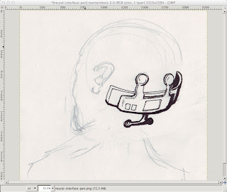
Prepare the pencil based artwork on a nice big piece of paper.  Don't worry about the details as you'll work over these in pen later.  Here I just wanted the neural interface gizmo to look like it would go on a human head, so that head is just there to get the shape right - it will disappear in the final result.  Notice how I don't bother rubbing out either - when I want to reposition something I'll just draw over it in the new spot, and pick the right line when I ink it.  Also note that I have not used blue - you can but typically you don't need blue pencil, and black pencils come in more kinds and are cheaper.
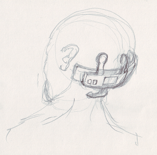


Ink over the pencil using your favourite pens.  I use Mitsubishi uni-ball ink pens which are nice and fast and dark, and Pentel chisel point art-markers.  I have some crow quills and a tub of ink somewhere but they're so messy.  Fibre tip fine pens are OK, but I find they scratch and split too much as I always press too hard.  Ball tips are fine as long as you start out with a big piece of paper.

Don't fret too much about mistakes as we can correct a lot of things digitally later.  The main thing is to get the ideas out onto paper.  Make your inking fairly bold and go over outlines to strengthen them up.  Areas with more ink I use the marker, sometimes I can get away by using the edge of the chisel-point, other times I have to go over the lines several times with the ball-tip.

Time to scan.  I just use a cheap CanoScan LiDE 25 USB scanner that works fine with my Mac gear.  Scan at 600DPI, and use the color setting, not the black and white.  I find if you try to go that way you'll lose too much detail from the drawing.  Its much better to threshold it in the drawing program as I'm about to show below.  Crop out unnecessary blank paper using the scan dialog if needed.  This will make the sketch load into Gimp a lot quicker.

For my art work I use a mixture of Manga Studio Ex for full comic spreads, and the Gnu Image Manipulation Program or GiMP for detail work.  MSEX is good but expensive.  And for some jobs GiMP is just as good.  If you're on Mac and haven't used GiMP for a while it has gotten really good, thanks to the work of the Free software community - it now runs natively and does not require an X server.  Its also a lot faster and many of the weird mouse-focus issues are fixed.  Obviously if you're on Windows or Linux, your mileage may vary.  For this article I'll be using GiMP, but the principles and tools apply to most platforms and other drawing programs even tho' the actual commands and menus may change.

Load up the image into GiMP.  Notice how the yellowy paper and pencil work is visible right now.  That's fine and you want to be able to pick and choose what stuff you leave in and out.

You should have a large image - mine came out 2310 x 2284.  If you get a small image - say 1024 x 768 or similar then your line work is going to get eroded by the threshold which is not what you want.  Either you need to get a bigger bit of paper and draw bigger, or check your scan DPI and ensure its 600DPI or maybe try a higher setting.  The images here have been scaled down to make for smaller uploads so don't go by their sizes.

Now for thresholding.  Right click on the image in GiMP to get the menu and choose Colors > Threshold.  If you're lucky the auto setting will be about right.  If there is too much unwanted stuff, or not enough ink, move the sliders around until you're happy.


Now that we have just the inked line art, we need to get it onto a transparent layer so that color can be applied.  The actual color will be done in another article/tut but getting the setup right as I'm about to show should apply to almost all methods of coloring that you might want to do.  The way it is right now looks OK, but the problem is any fills you apply will not appear to go right up to the edge of the line.  What you want is the line art on top of the color so that you can avoid white pixels where the lines edges are aliased.

Right click on the drawing to get the GiMP context menu and choose Select > By Color.  Click in the black line work, and after some time you should see all the ink selected as below.  It takes GiMP a while even on faster machines as it has to color match every pixel and we have a big image here.  Once its selected, choose Edit > Copy.  Now create a new layer, by clicking the anonymous little white "New Layer" button in the bottom-left corner of the layers dialog.  Name your layer "line-art".  Make sure the layer is transparent (not background color).


With the new layer selected choose Edit > Paste.  In the Layers dialog you will see a "Floating Selection".  Click the Anchor button on the Layers dialog to anchor it to your new layer.  Try turning on and off the eye icons - you should see that you now have a layer with just the linework and a transparent background.  Its hard to see what's going on with the linework, because of how transparent layers are displayed.  Next we'll add a white background to fix that.

Let's add two more layers: one will be transparent - call it "color" as this is where our color will go; and the last one will be white - call it "white background".  I always make a practice of naming my layers as they can quickly get out of control in a larger piece of art.  Make sure the line art is on top, with the transparent color layer and white background underneath.  You can turn off the original import by clicking the eye, as you don't really need it.  Turning it off should make your image appear just the same as after thresholding.  Now your layer dialog should look like this.


This is a good time to save your work.  Make sure that you save it in the .xcf format, by putting the characters ".xcf" as the file name ending.  This is GiMP's native format and it will preserve all your layers and so on.  Think of this as like the "raw source code" of your image, and you will "compile" it later by exporting to other formats such as .png.  If you don't have the xcf around its hard to recapture the structure of your drawing, so save to .xcf, save early and save often.

OK now we want to start cleaning up the image.  This involves a few GiMP skills that I will try to describe in more detail in another tutorial, but here is the guts of it:

  • do a lassoo select around your line art and then choose Select > Invert so that your next operation will apply to everything outside your linework.   Now use a really large eraser to clear out all the little dots and blobs from the background.
  • zoom in to your work with + and go over the lines with the Ink tool - press K to get it quickly and switch between Ink and Eraser (Shift E) as you clear up the lines
  • try using the "smooth" setting on the ink tool to help stabilise your ink strokes, and experiment with the settings.  I prefer a hard edged brush so check the brush settings if you're getting an effect that doesn't look right
  • to get long smooth lines you can use the Path tool and tell it to trace the path in Ink.  This works well but is complicated to get right and is the subject of a tut all by itself
  • fix up larger issues like scale or perspective by lassoo'ing the offending chunk of linework and using the rotate, shear and other transform tools.  Save is your friend.  command-Z is undo.
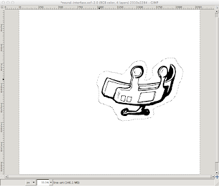
This shot shows removing splash around the linework using inverse-select and a large eraser.  (The screen grab didn't capture the eraser but its as big as the whole line art and clears the page in a few swipes).


Here I have cleaned a lot of linework with the Ink and Eraser tools - see around the nodule thing on the right hand side especially - and also the underneath chrome part has been rotated so its perspective is a bit more correct to the rest of the device.  (I took the inverse-select screenshot after doing this cleanup so to see the effect compare it with the post-threshold image above).

Save the .xcf file again at this point and use the "Save a copy" feature so that you can revert back to your good line art if something goes wrong.  Give it a name like "my-device-line-art.xcf".

At this point you would go ahead and start applying your layers of color on your "my-device.xcf" working image file.  Make sure to use separate layers, and not to mess up your line art layer.  Just to show the beginnings I have blobbed some color onto a couple of layers - the blue (which would become a metal chrome color job) is on the "color" layer from before and the orange I have put on a layer above that called "lights".


Anyway - that's all for this one, and hope you have fun GiMP'ing your line art.  

Monday, December 10, 2012

Coming Out

It feels so good to be out of the closet.  Here is my big admission!

I am a wannabe indie game hacker!!!
The crowd shuffles nervously.  Is she for real?  Wow - brave to come out like that, but geez those folks who think they can be indie game coders - soooo llaaaaaammmme.
Well if I ever worried what people thought I would never do anything.  :-)

Here's a screenshot of very early days game screens, just to show that I'm not completely delusional.

Ethex Screenshot (C) Sarah Smith 2012

What's it all about?  What kind of a game is it?  What's the tech stack, platform, genre?  How did you create that artwork?  Well - keep posted, subscribe to the blog and all will be (incrementally) revealed.

So this blog post marks the beginning of a few things for me:
  • I am officially taking my indie game coding efforts seriously
  • This right here is going to be my development blog
    • updates on progress
    • screenshots
    • insights on the game design process
    • sez-cam: developer eye view of game dev in the raw
  • I will also post random tutorials, learnings and snippets
  • Commit to posting here at least a couple of times a week
And, when my game gets to the point I can publish, you'll know it right here, first thing.

Why would I do all this?  Haven't I got a game to write?  Well, yeah - but its hard hacking away by yourself in a room.  This blog is my way of letting you all in to shine a little light, keep me sane, and maybe lend some encouragement on the way.

In return I hope there's some useful stuff, some entertainment and a few lessons.

Oh, and quick note to the "borrowers" looking for free game art and resources - my definition of success here is that my game makes money.  I don't want to give away my art for free.  I want to make a living out of making games so I can keep doing it.  So this is not a site full of free stuff: if I post some images here or any other game resources, unless I say otherwise they're not for folks to dump into some knock-off game and call it their own work.  Didn't I use Free technologies, and other free stuff from kind people?  Yes!  Doesn't that mean I should in turn give away what I do?  No!  Hey, I hope that is obvious.  Any questions about this contact me in the comments.

Code is an exception mostly: in general in code I post here will have a notice on it that you can use it for whatever you like.  The full source code for the game is not going to be open-sourced, but I have a plan to make as much of the framework of it as I can open-source eventually.  That is I want to split out the artwork and content from the machinery - but that has to be a secondary goal to making a real working game.

So welcome.  And please keep up the commentary - here or on my Google plus account, check the side bar for details of that.